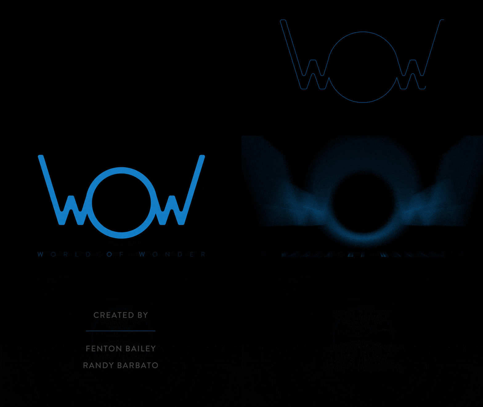
Project: World of Wonder
This was more of a re-branding project. Suffice it to say it was an opportunity to pitch brand creative to World of Wonder - a Hollywood production company known for creating such films as as Mapplethorp: Look at the PIctures, Party Monster as well as producing RuPauls Drag Race, Million Dollar Listing, and DragCon. Needed a designer, so I went all out to demo them what I could do for them, design, motion, re-branding, etc.

01: Concept
Started with new logo identity. B&W version ala Logo Design Love by David Airey
I am an advocate of logo’s that serve a dual purpose that describes a brand visually and narratively. In this example, the “O” is larger for two reasons, First it doubles as the world and we know the world is a big place. This helps imply the message that it is well resourced with content that appeals to consumers all oer the world and implies a universal presense and unity. Second, it helps to emphasize the ‘awe’ which is synomymous with the word ‘wow. As an added bonus, when you say the word ‘wow’, the emphaisis is on the open middle sound of ‘aw’, wOw. That’s where the action is, in the middle. You’re in the middle of it all. Lastly, the ‘W’’s on either side not only represent the words ‘World’ and ‘wonder’ but also help to reinforce the idea and image of a pulse or hearteat as it traverses through the world.


Version 2 - Abstract
Version 2 - Abstract

02: Color
Version 2 - Abstract